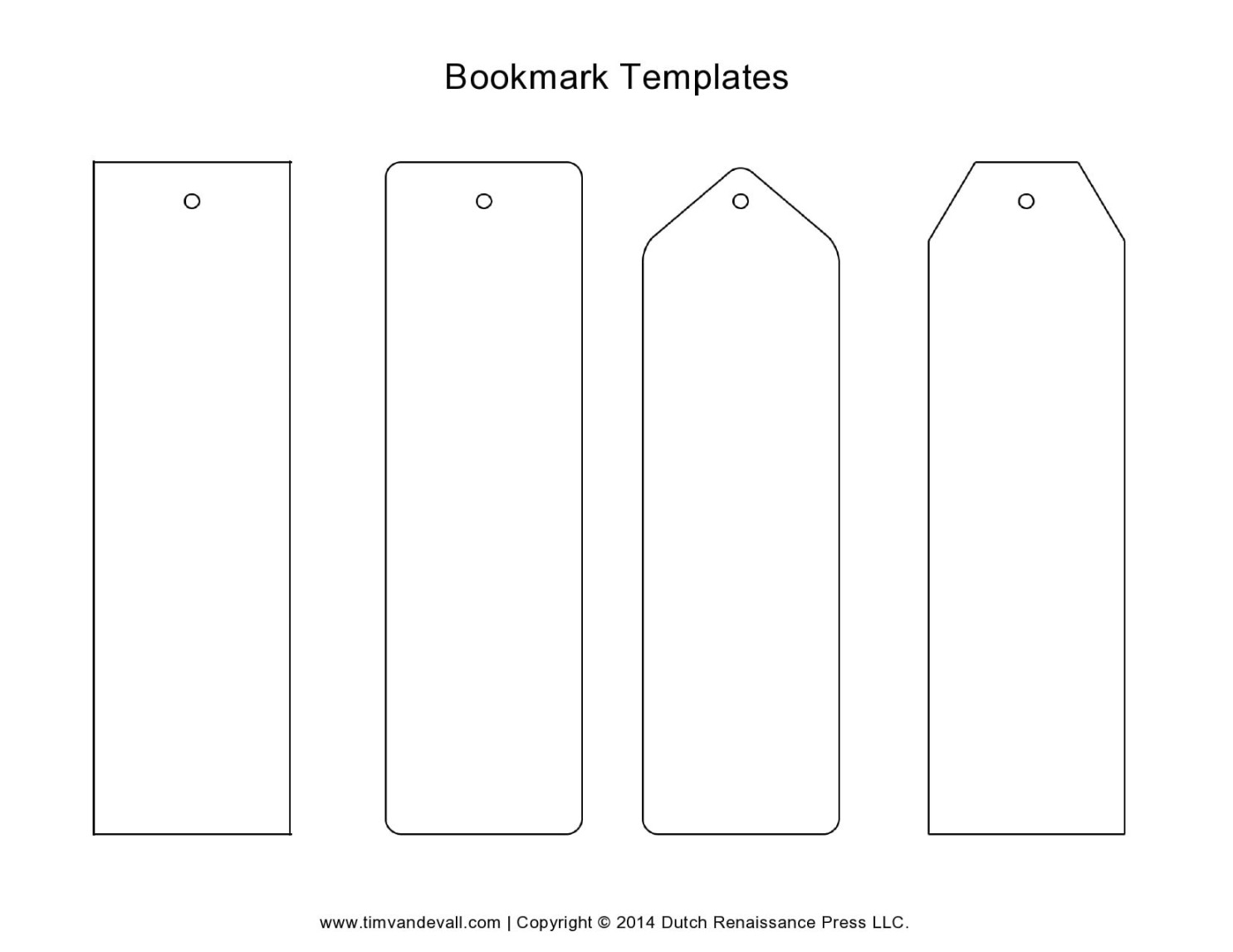
Designing a professional bookmark template can be a simple yet effective way to promote your brand, share important information, or simply add a touch of elegance to your reading experience. In this guide, we will explore the essential elements to consider when creating a high-quality bookmark template that leaves a lasting impression.
Font Selection

Choosing the right font is crucial for establishing a professional and visually appealing bookmark. Opt for fonts that are easy to read and complement the overall aesthetic of your template. Serif fonts, such as Times New Roman or Garamond, often exude a classic and formal feel, while sans-serif fonts like Arial or Helvetica offer a modern and clean look. Consider the font’s weight and style to ensure it is legible and enhances the readability of your content.
Color Scheme
A well-chosen color scheme can significantly impact the perceived professionalism of your bookmark template. Stick to a limited palette of colors that harmonize and create a visually pleasing composition. Consider using a combination of neutral colors, such as black, white, and gray, with one or two accent colors to add interest. Avoid using too many bright or contrasting colors, as this can make the template appear cluttered and unprofessional.
Layout and Composition
The layout and composition of your bookmark template play a vital role in its overall effectiveness. Strive for a clean and uncluttered design that allows the essential information to stand out. Use white space strategically to create a sense of balance and visual hierarchy. Consider using a grid system to align elements and maintain consistency throughout the template.
Content and Information
The content you include on your bookmark should be relevant, concise, and easy to understand. Avoid overwhelming the reader with excessive text or complex information. Focus on delivering key messages or calls to action in a clear and engaging manner. If you are using your bookmark for promotional purposes, include your brand name, logo, and contact information.
Branding Elements
If you have an established brand identity, incorporate your brand elements into your bookmark template to reinforce your recognition. Use your brand colors, fonts, and logo consistently throughout the design to create a cohesive and professional look. By aligning your bookmark with your overall branding strategy, you can strengthen your brand awareness and leave a lasting impression on your audience.
Call to Action
A strong call to action can encourage readers to take the desired action, whether it’s visiting your website, contacting your business, or sharing your content. Place your call to action prominently on the bookmark, using clear and compelling language. Consider using a button or a contrasting color to make it visually prominent.
Printing and Materials
The quality of the printing and materials used for your bookmark can significantly impact its perceived professionalism. Choose a high-quality printer and paper stock that complements your design and ensures durability. Consider using a thicker paper or Cardstock for a more substantial and luxurious feel.
Conclusion
By carefully considering the font selection, color scheme, layout, content, branding elements, call to action, and printing materials, you can create a professional and visually appealing bookmark template that effectively serves your purpose. Remember to focus on clarity, consistency, and a clean design to leave a lasting impression on your audience.