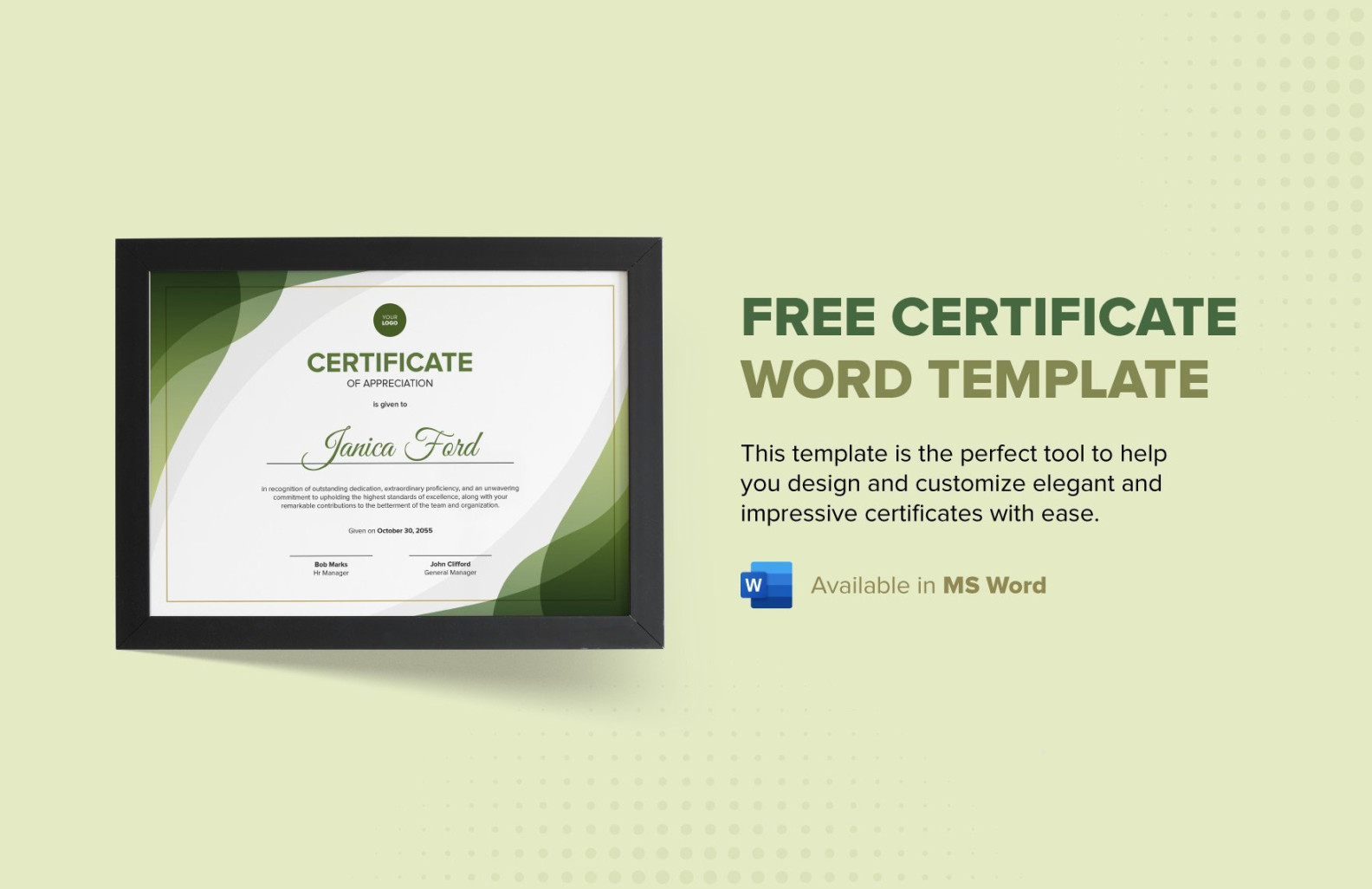
Crafting a visually appealing and professional Certificate template in Word is essential for recognizing achievements and accomplishments. A well-designed certificate not only validates an individual’s efforts but also adds a touch of prestige to the occasion. By incorporating specific design elements, you can create a template that exudes professionalism and trustworthiness.
Font Selection

Choosing the right font is crucial for establishing a formal and polished look. Opt for fonts that are clean, legible, and easily recognizable. Serif fonts like Times New Roman or Garamond are classic choices for formal documents. Avoid using overly decorative or script fonts, as they can appear less professional.
Layout and Structure
The layout of your certificate should be well-organized and easy to read. Consider the following elements:
Header: The header should prominently display the name of the organization or institution issuing the certificate. Use a larger font size and a bold or italic style to make it stand out.
Color Scheme
A carefully chosen color scheme can enhance the overall aesthetic appeal of your certificate. Stick to a limited palette of colors that complement each other and create a harmonious look. Consider using a combination of neutral colors, such as black, white, and gray, with a few accent colors.
Graphics and Imagery
While graphics and imagery can add visual interest to your certificate, use them sparingly and strategically. Avoid using overly busy or distracting graphics that can detract from the main focus of the document. Consider incorporating a simple border, a subtle background pattern, or a relevant logo.
Alignment and Spacing
Pay attention to alignment and spacing to ensure a clean and professional appearance. Use consistent alignment throughout the certificate, such as left-aligned text for the body and centered text for the header and footer. Maintain adequate spacing between different elements to avoid crowding and improve readability.
Paper Quality
The quality of the paper used for your certificate can significantly impact its perceived value. Opt for a high-quality paper with a smooth finish, such as parchment or vellum. Consider using a paper color that complements the overall design of the certificate.
Printing and Finishing
Once you have finalized your certificate design, print it on a high-quality printer using a laser printer or a professional printing service. Consider adding finishing touches, such as embossing, foiling, or a ribbon seal, to further enhance the certificate’s appearance and prestige.
By carefully considering these design elements, you can create professional certificate templates for Word that effectively recognize and celebrate achievements. Remember to tailor your template to the specific needs and branding of your organization, ensuring that it leaves a lasting impression.